The new high for the Nasdaq 100 and the closeness of a new high for the S&P 500 have bulls excited. It’s too bad that key breadth measures are failing to confirm the price move. The NYSE advance/decline index is a problem for the markets advance from the early April lows. So is the “bullish percent index” for the two stock indexes.
If you study the message sent from the price charts, it’s unnecessary to connect it to the latest news stories. War in the Middle East. A new Mayor of New York. Criminals posing at ICE agents. There’s a lot to talk about but it’s studying and understanding how it all plays out via price patterns.
The breadth measures are diverging negatively from the stock market indexes. That’s a problem, eventually. Combined with the remarkable, little-mentioned serious overvaluation, it tends to add up.
NYSE Breadth Fails To Confirm S&P and Nasdaq Rally
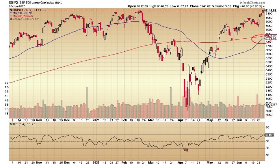
The daily price chart for the S&P 500 now looks like this:
The price seems to have touched the February high and then moved downward slightly. The 50-day moving average (the blue line) is headed for a cross above the 200-day moving average (the red line). Such an event would have a bullish kind of look to it. The relative strength indicator (RSI, below the price chart) is not confirming the up move.
The Nasdaq 100’s daily price chart is here:
The index now has two days of higher highs than February. Today’s candlestick is definitely a breakout. The 50-day moving average (the red line) has crossed above the 200-day moving average, a sign of strength.
The NYSE advance/decline index looks like this:
The number of advancing issues versus the number of declining issues is lower now than in mid-April or in mid-May. Despite the higher highs of the two big stock indexes, this breadth measure is saying that the rally is weaker than it looks.
The S&P 500’s “bullish percent” index is here:
The percent of S&P 500 stocks in bullish point-and-figure patterns is lower now than it was in mid-May. The red dotted line shows how the index is headed down and failing to confirm the upward-ness of the stock market indexes. A move up on fewer and fewer advancing issues is a sign of underlying weakness.
Total stock market ETF versus gross domestic product:
This is a slight variation of the so-called Warren Buffett indicator. He uses the Wilshire 5000 – I’ve substituted Vanguard Total Stock Market ETF for the same basic result. Investors are paying more for stocks than they ever have. Based on this simple valuation measure, the “total stock market” hasn’t been cheap for a long time.
Stats courtesy of FinViz.com. Charts courtesy of Stockcharts.com.
No artificial intelligence was used in the writing of this post.
More analysis and commentary at johnnavin.substack.com.

