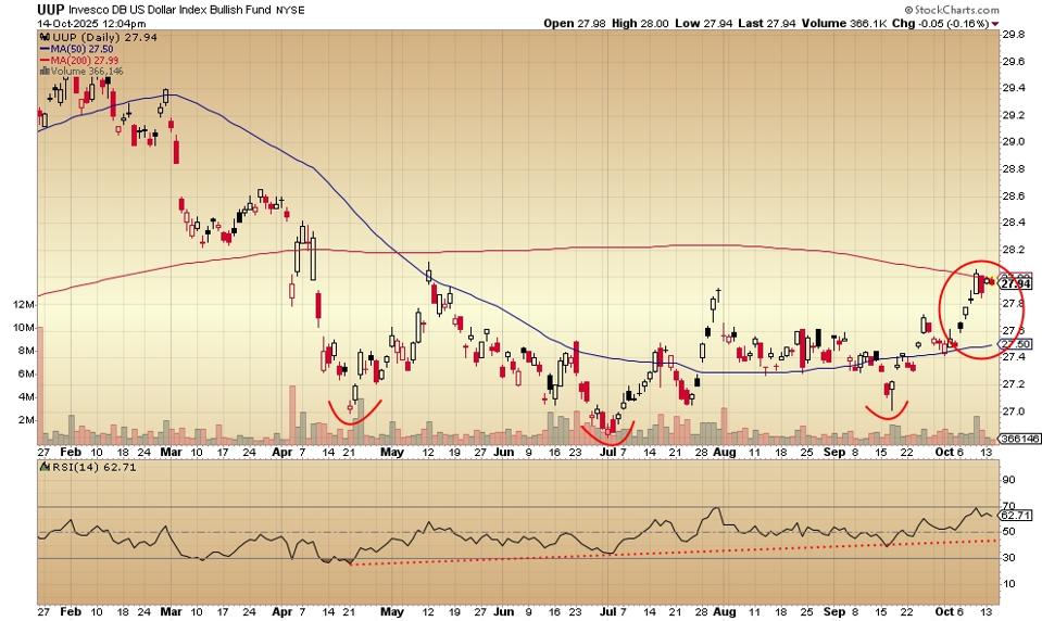
An inverse head and shoulders pattern may have developed on the daily price chart for the Invesco DB US Dollar Index Bullish Fund.
This is the NYSE-listed ETF designed to generally track the movements of the dollar versus a basket of other currencies. That basket includes the British pound, the Yen, the Euro and the Canadian dollar, among others.
The central meaning is that it may have stopped going down and may be in the process of going up. It may also indicate that global currency folks who trade are now considering whether interest rates have stopped going down and may be about to go up again.
The Dollar ETF With The Inverse Head And Shoulders Pattern
Some of this thinking, now showing up in price movement, is related to an understanding by the pros that confidence in the dollar would be regained, substantially, if and when rates go up. And that’s closer than generally thought – according to the price chart pattern.
That some on the Federal Reserve Board – in the most recent minutes of the last meeting – are expressing thoughts along these lines shows how sharp traders and their algorithms manage to stay ahead of the pack. The artificial intelligence helps but probably not as much as the years and years of human experience.
The dollar ETF chart shows the weeks-long pattern now of more buyers than sellers. Each low is higher than the previous low. That is, whenever the price falls, buyers re-enter at a higher and higher level. Inverse head and shoulders.
These are bets that rates will go up and bonds will sell off. Confidence returning to the dollar would mean a lot to different types of markets.
Here’s how the daily price chart looks:
The April low, the early July low and the mid-September low reveal the upsidedown head and shoulders pattern, noted by some analysts as a possibly significant indicator of the potential for upside price action. That is, a low for the fund may be in. The rising relative strength indicator tends to confirm this.
The 50-day moving average (the blue line) is headed upward after bottoming in late July/early August. The price is finding resistance now at the 200-day moving average (the red line).
The cash settlement for the Forex-traded dollar (not the NYSE ETF) has a slightly different pattern, but the basic look is similar. The daily price chart is here:
The Invesco DB US Dollar Index Bullish fund is ahead of the Forex-traded cash dollar. The mid-September low is so close to the early July low that it’s interesting, especially when compared to the ETF’s pattern.
Here’s the weekly price chart for the exchange traded fund:
The fund peaked in early January 2025, dropped to the level of the August/September 2024 lows and has rallied from there to the present. The challenge will be to make it above the 50-day moving average which is now just above the price.
Stats courtesy of FinViz.com. Charts courtesy of Stockcharts.com.
No artificial intelligence was used in the writing of this post.
More analysis and commentary at johnnavin.substack.com.

