Pop punk band Mayday Parade is in the midst of releasing three new records, each with its own unique spin.
The trilogy is a venture into new realms for the band, which celebrates its 20th anniversary. A self-released project, the quintet released the second instalment, Sad, on Oct 3.
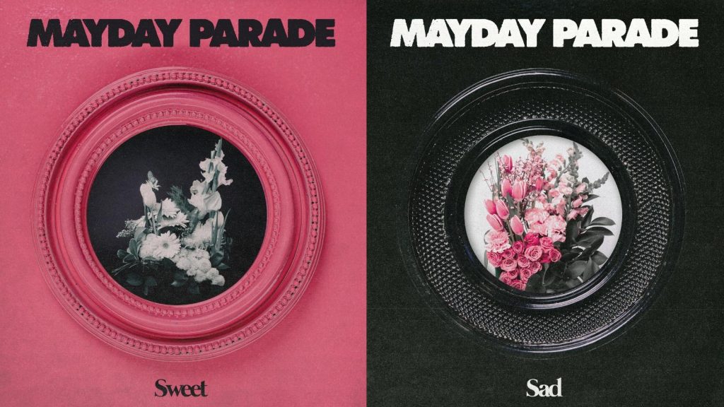
New York-based designer, art director and producer Benjamin Lieber worked with Mayday Parade to bring the album covers to life. The band told Lieber that they planned to release a trilogy of records that were cohesive in design while still having independence.
“The aim was to create similar structural elements to each other so that they could kind of line up together really easily,” Lieber said. “There was also a desire to aggressively tie to a pink, black and white color scheme, which is something that they’d never done, so this was an opportunity to chase that. I built everything around that approach,”
Taking the prompt that everything should be structurally the same, Lieber settled on using a picture frame as the placeholder, where whatever was within it could change, but the frame would remain the same.
Lieber then began working on what would feature in the frames. Sticking with the pink, black and white color scheme, he wanted to blur the lines between nineties, punk, gritty energy and the band’s existing aesthetic, which Lieber notes is “a little more gentle and beautiful.”
“Finding a middle ground between those two things, we landed on the flower approach within the picture frames,” Lieber added.
Lieber’s wife, Kelsey, is a florist and was the artist behind the flower arrangements that are at the center of the album covers. “I think the flowers added this gentle, beautiful touch that is more akin to Mayday Parade’s history, and it bridges those worlds together. It’s something that was relatable to where they’ve come from, but also felt like this new step forward,” he explained. “We really were happy with this concept once we found it, because we felt like it could really be adapted in a million different ways. The frame, subframes, the florals, the color schemes; all of it was very applicable to a bunch of different mediums such as merchandise and live shows.”
Mayday Parade’s singer, Derek Sanders, was also very involved in the design aspects of the new records. Before reaching out to Lieber, Sanders had created mockups of the designs. “These albums feel a little different from what we’ve done before, and the artwork falls into that same area. It feels unique for us, and I think it’s really nice,” Sanders said.
The albums covers really come alive on stage, with Mayday Parade currently on tour alongside All Time Low. Mayday Parade also recently wrapped up its Three Cheers For 20 Years tour, where fans got a glimpse at the album design through set visuals and merchandise.
“On our North America tour, there was a big pink circular mirror in the middle of the stage representing the album artwork, Sanders said. “That’s when it gets fun, when all the elements come together and feel cohesive,”
When it comes to the trilogy, Mayday Parade, like many other artists, wanted to find the perfect balance of a continuation of the band’s past eras while breaking away and creating something new. Through the visuals, sound, and overall aesthetic of the album, Mayday Parade achieved that goal with precision.
“Ideally, it’s a little bit of both. It’s not all one way or the other,” Sanders said. “The idea is to take what we’ve established, what we’ve built, what we’ve done well in our eyes, and build upon that, while taking it somewhere new.”
Sweet and Sad are out now.

